Tupy Corantes is a traditional Brazilian brand of fabric dyes, present in the daily lives of Brazilians for 45 years. The brand offers a diverse range of colors for various types of fabrics, allowing users to mix them to create new shades. With this in mind, the Tupy Color Mixer app was created.
Time frame: 3 months
My role: Product & Visual Design
Delivered on: November 2021
My role: Product & Visual Design
Delivered on: November 2021
What needs are we looking to solve?
“How can I easily know how much dye I need to use to get the desired color?” The process of dying a piece of fabric consists in measuring the weight of it, and then, based on the type of fabric and the color desired, it's required to know exactly the amount of dye needed to mix with the water in order to achieve the perfect color, but how do I calculate that? Today, only with expertise or several tries, until you get that desired tone.
1. Empower Users in Fabric Dyeing: Enable users to confidently choose the type of fabric, select desired colors, and manually mix pigments to achieve their unique and personalized shades.
2. Enhance User Creativity: Offer a user-friendly interface that encourages experimentation with color mixing, allowing users to explore and create a wide range of unique and custom shades.
4. Simplify Fabric Selection: Implement an intuitive system that guides users in choosing the right fabric type, considering factors such as material, weight, and weave, to optimize the dyeing results.
6. Error Prevention: Incorporate features such as real-time feedback, warnings, and color previews to help users avoid mistakes, ensuring a smoother and more successful fabric dyeing experience.
Research and Discovery
I tested out different options available at Play Store of apps focused on mixing colors and evaluated the pros and cons of different interface designs, highlighting their strengths and weaknesses based on NN/g UX Design Heuristics and best practices.
Unfortunately the deadline and budget of the project didn’t allow me to run a user test or research.
Information Architecture & Wireframe
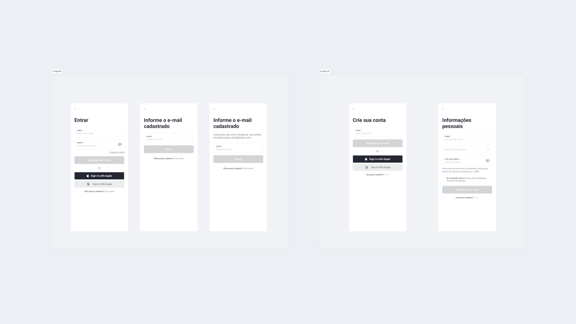
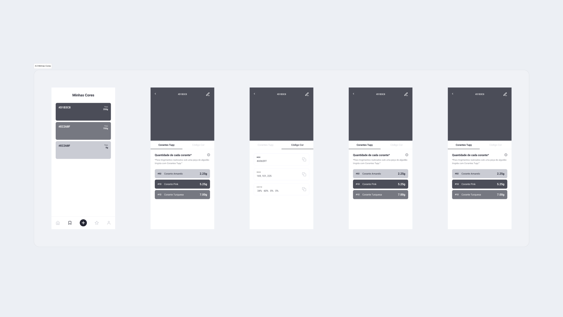
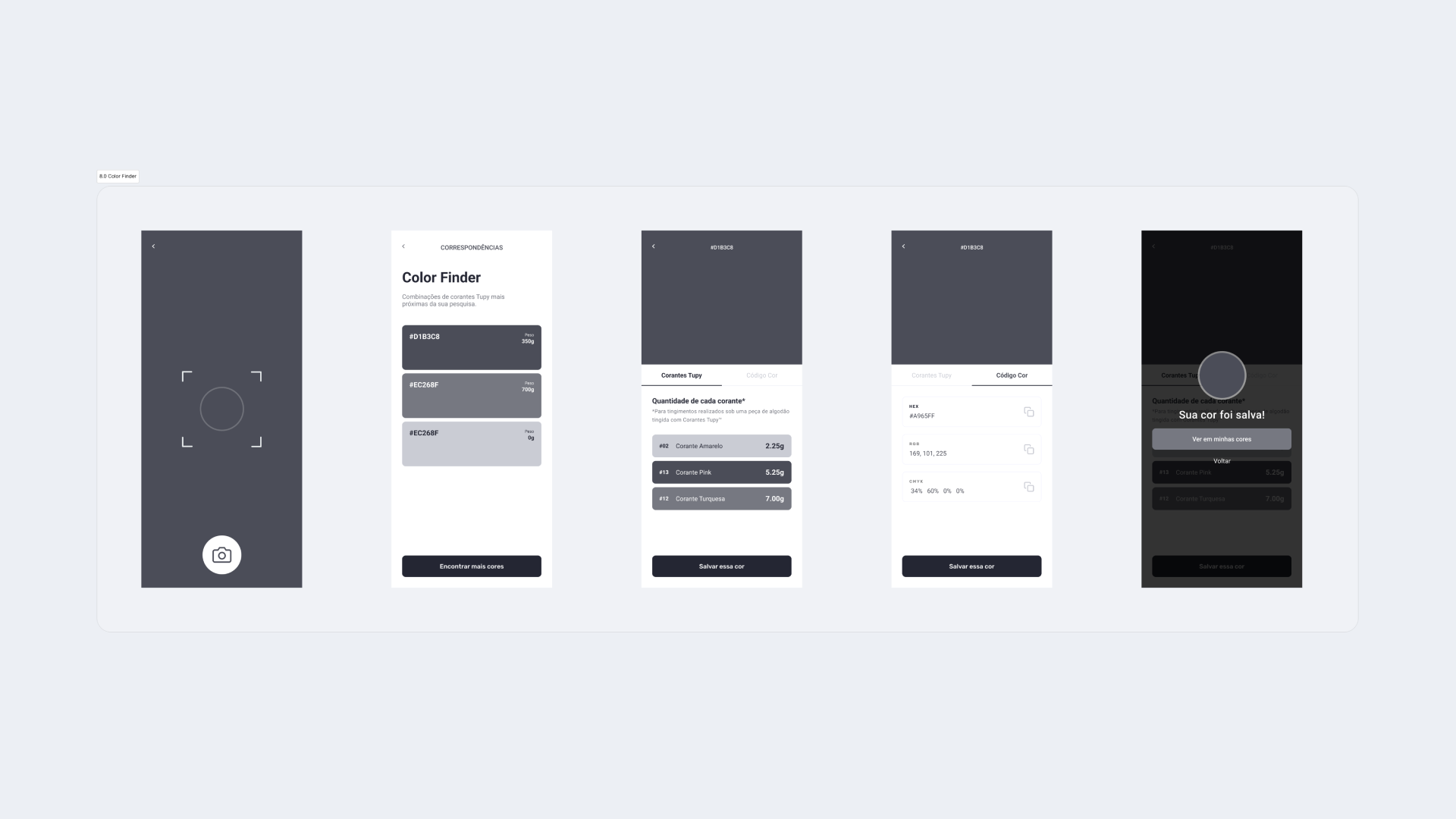
With the information discovered at the research phase I created an user flow map to outline the key pages and functions for the MVP. Based on the screens list I was able to start working on initial wireframes.
Visual Design
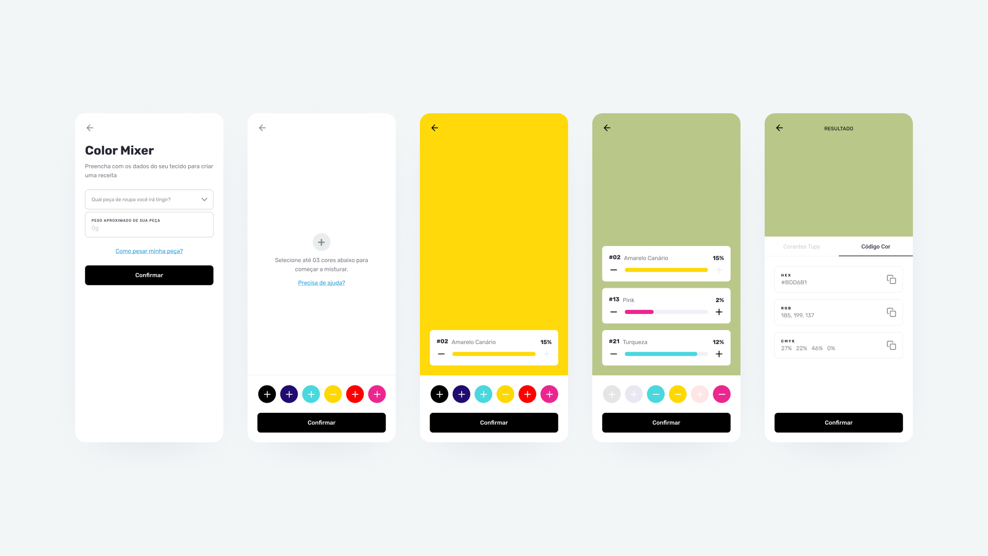
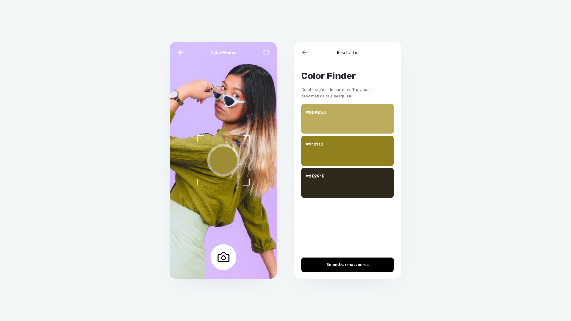
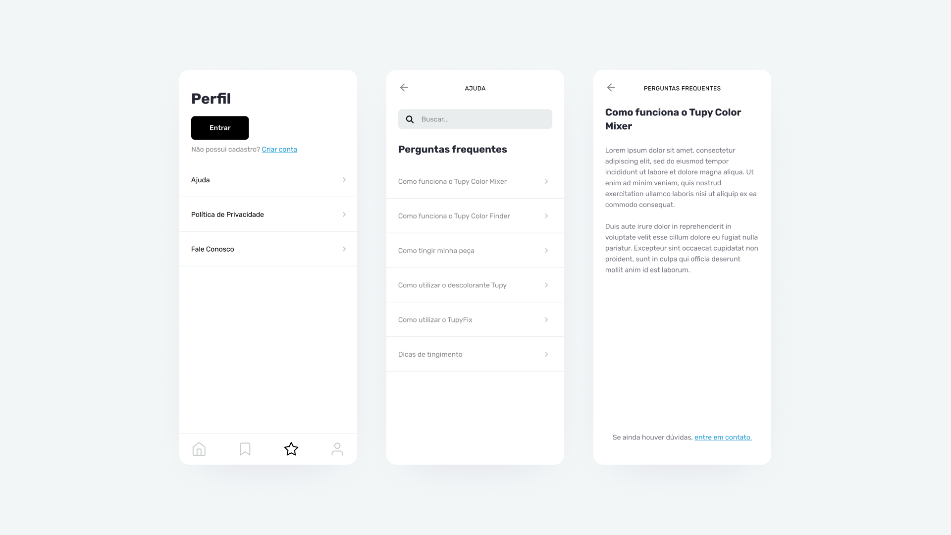
For the branding and visuals I decided to reference the brand’s original logo and its colors, since the app will work with color mixing I chosed to use a neutral color scheme for most of the interface to avoid contrast and readability issues.
Conclusion
- In this app, users can choose the type of fabric they want to dye and manually mix pigments to obtain the exact quantity of each color needed to achieve the desired shade. This simplifies the dyeing process and helps prevent errors.
- Further user testing and feedback analysis is required to assure an intuitive interface.
- Further user testing and feedback analysis is required to assure an intuitive interface.
